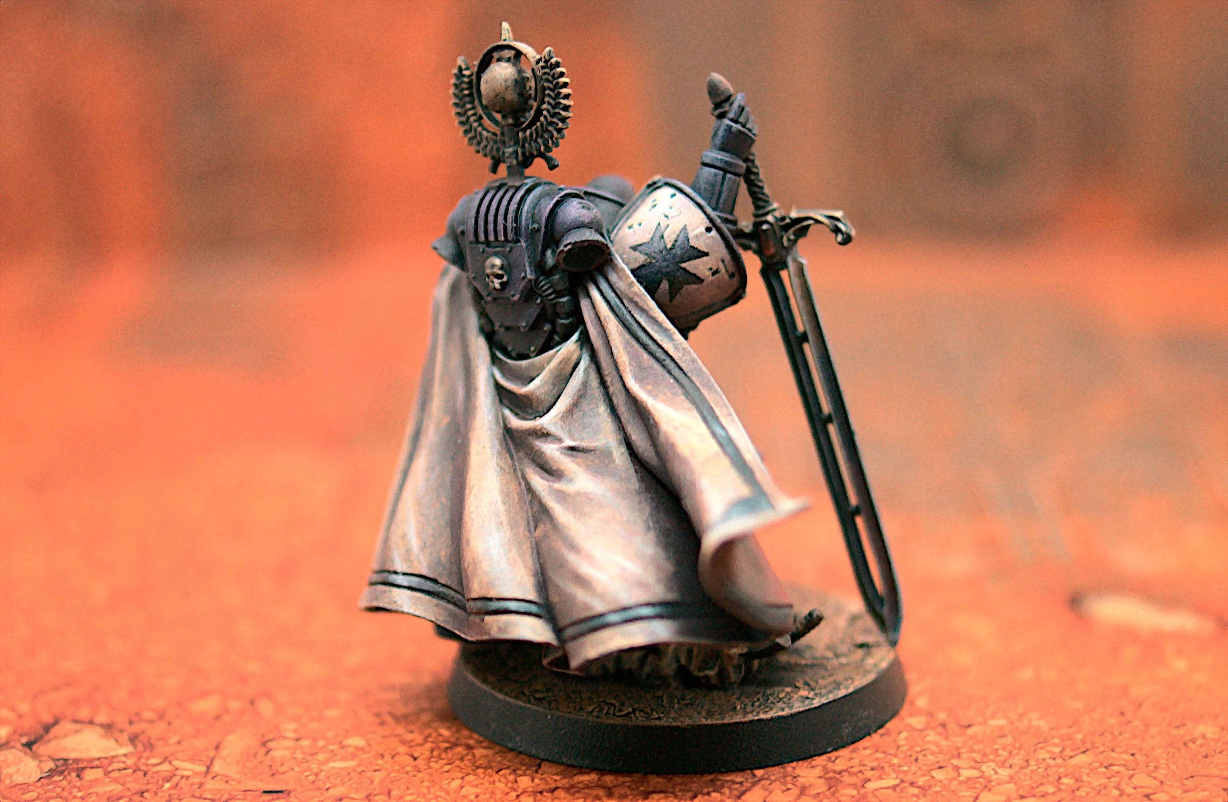
A Year in Miniatures 19: Black Templar Praetor
Like many hobbyists, my first thought when I saw the praetor models from the Age of Darkness box was a variant of “I’m going to need to paint those” (in my case the internal monologue was more along the lines of “ooh pretty”, but that means basically the same thing). Unfortunately, I didn’t have anything to actually use them for. The Dark Angles are already overstocked with characters, and I don’t really do much with space marines. Nor do I play 30k. I could have chaosified them of course, but that would have meant a lot of changes which would run the risk of spoiling the original design which I liked so much. Truly a conundrum.
Thankfully, this dilemma did not last particularly long. From somewhere I got the bright idea of building a diorama recreating the amazing John Blanche cover art from 40k’s 3rd edition. I’ll discuss that particular plan more as it develops, but in the short term it left me with a pressing need for space marines models to paint up as test pieces. Enter the Praetors.
Oh and just to head off the lore discussion - yes, I know that Black Templars are a second founding chapter, so do not have praetors. It’s a test model that will probably never see a tabletop, but if it makes you happier feel free to mentally replace ‘praetor’ with ‘marshal’.
No big conversion work on this one, just a simple head swap to bring a little more Templar iconography into the mix, and reversing the sword. The latter was to create a pose that implied stability and resilience rather than the “leading the charge” feel that the original had, although it does have a side effect of demonstrating just how stupidly large that sword is when an Astartes has to fully extend an arm above his head just to reach the end of it!
Since this is a test model, its purpose is to be assessed so we can adjust the scheme going forwards. I thought it would be interesting to record that here.
Things to Keep
The armour reads pretty well as black, especially contrasted with an orange environment, and has pretty satisfactory contrast between highlight and shadow.
NMM gold looks good, especially the skulls (very important for warhammer!).
Brown leather actually working well for once (something I’ve struggled a little with in the past)
Liking the painted-on chipping a lot better than the chipping medium.
Environmental reflections on the sword are nice.
Things to Change
Red cloth elements need a lot more saturation for this sort of background.
Lots of blending problems caused by the primer going on thick and rough - this is a good reminder not to prime in the cold! Since the diorama elements are not intended to be handled, we can probably forego priming altogether in their case.
If we want to match Blanch, we will need to sharpen the highlights on the armour, and probably add some environmental reflections to help sell the illusion.
Can go a lot brighter on the sword - more contrast and more saturation to help sell the reflections.
We’ll be referring back to this when I finish up the other Age of Darkness Praetor, and we’ll see how well I manage to implement these changes!
Thanks for reading! Sadly, this brings us to the end of the unpublished backlog, so updates are going to slow down again, especially since I’m currently laid low with Covid. I’ve got a few projects on the go at the moment, the one I’m planning on finishing next is a particular passion project for me that I just can’t wait to share with you, and from an IP that we haven’t touched on so far this year. I’m working hard to get it finished, so you should see that within the next couple of weeks.
See you then!
09/11/22
Weeks Elapsed: 45
Miniatures Finished: 41


